Waffle Chart Presentation Slide Template
Product Description
Percentage Grid Chart Layout
Presenting percentage data through plain pie charts or bar graphs can feel repetitive, especially when you want your audience to grasp proportions at a quick glance rather than calculating angles or comparing bar heights. This Waffle Chart Template solves that by using a grid of small squares or dots, where each filled unit represents a percentage point, making the data visually intuitive and easy to digest.
For presentation storytelling, this proportional data chart works particularly well in market research reports, customer feedback summaries, employee survey results, and NPS score presentations. Marketing teams can use it to show campaign performance percentages, while HR departments might use it for employee satisfaction or retention rate comparisons. Product teams presenting feature adoption rates or user engagement metrics will also find this layout effective for making numbers feel less abstract.
The grid based percentage chart in this template is built to be fully compatible with both Microsoft PowerPoint and Google Slides, so analysts and presenters can adjust the filled units, colors, and labels regardless of their preferred software, making collaborative editing simple.
What makes this percentage visualization template stand out:
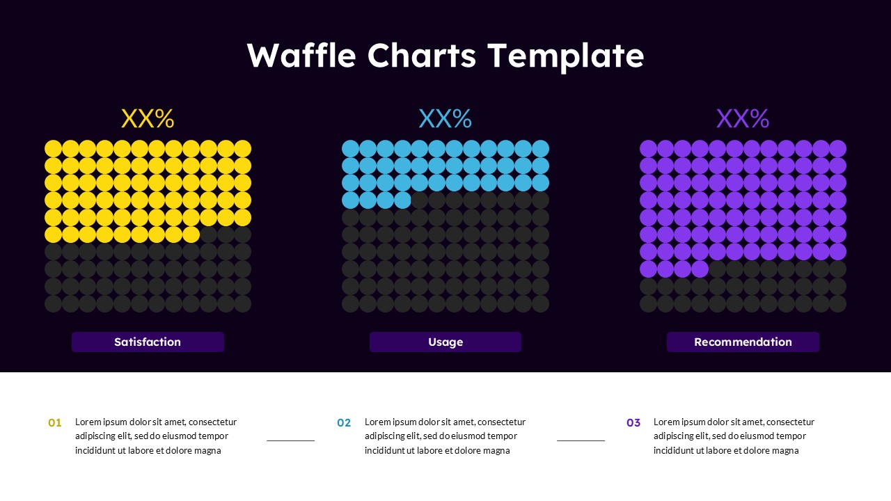
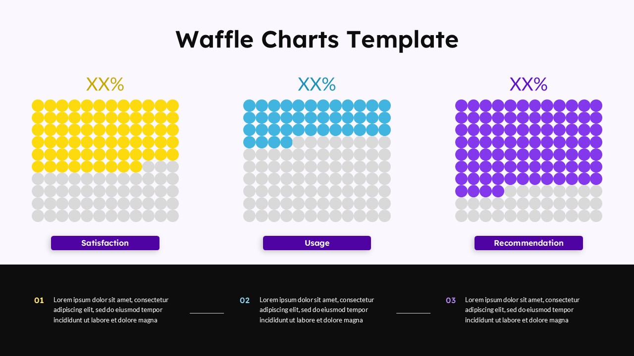
- Three side by side waffle charts let you compare multiple metrics at once, such as satisfaction, usage, and recommendation scores, each shown in a distinct color (yellow, blue, and purple) for quick differentiation
- The dark background with bright accent colors creates strong contrast, helping the filled portions of each chart stand out clearly even on screens or projectors
- Each chart includes a percentage label at the top and a labeled tag below, so viewers immediately understand what the data represents without needing extra explanation
- Below the charts, three numbered text blocks give space for additional context, methodology notes, or key takeaways related to each metric
Frequently Asked Questions
Can I change the percentage values shown in this Waffle Chart Template?
Yes, you can manually fill or unfill the squares to represent any percentage, giving you full control over how each chart looks.
Is this template suitable for survey result presentations?
Absolutely. The clear visual format makes it ideal for displaying satisfaction scores, usage rates, and recommendation percentages from survey data.
Login to download this file
What do you think of this template?
-
Category:
Business -
-

-

Item ID: SPT0813
-

Designed by: Niranjana
-

Color
Related Templates
-

Free Area Chart Dashboard Slide Presentation Template
Charts & Graphs
-
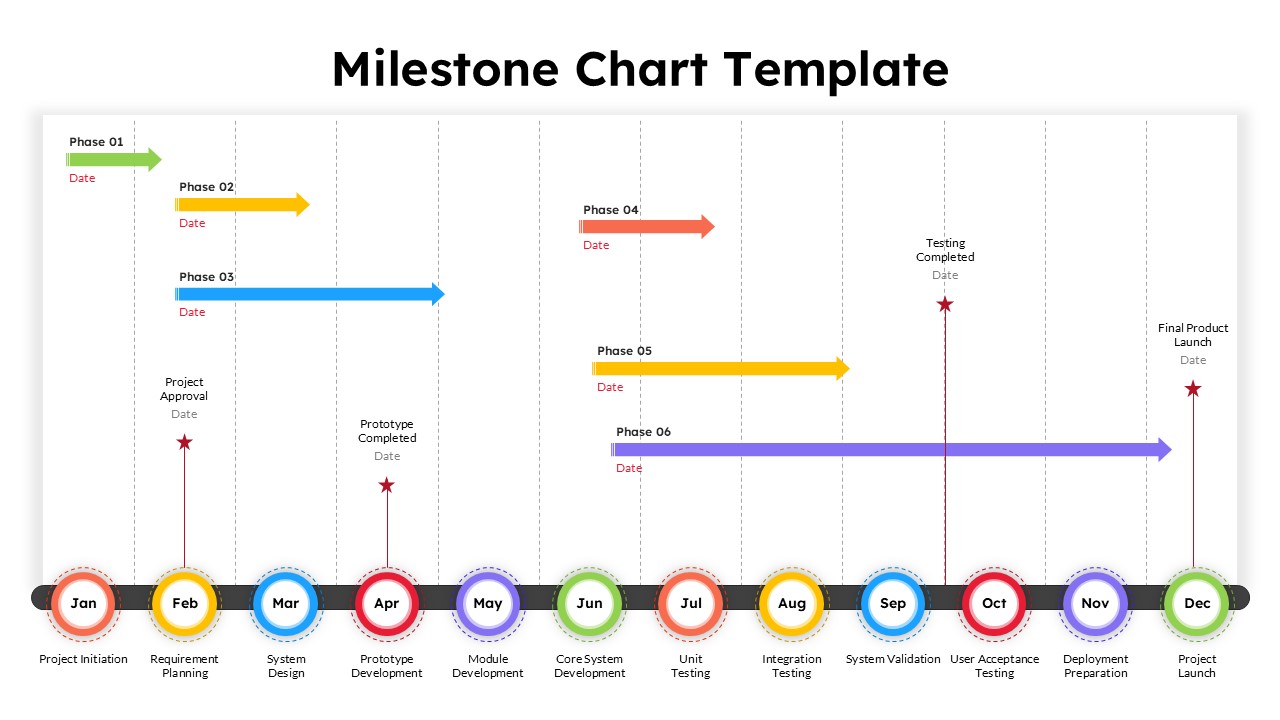
12 Month Milestone Chart Presentation Slide Template
Project Management
-

PERT Chart PowerPoint & Google Slides Template
Project Management
-

Free Column Chart Comparison Presentation Template
Charts & Graphs
-

-

-
-

-

-

-

-


