Blank Comparison Chart Infographic Slide Template
Product Description
Most presentations lose the room the moment a comparison slide appears. Too much text, no visual logic, and three options that all blur together by the third bullet. This Blank Comparison Chart Template was built to prevent exactly that.
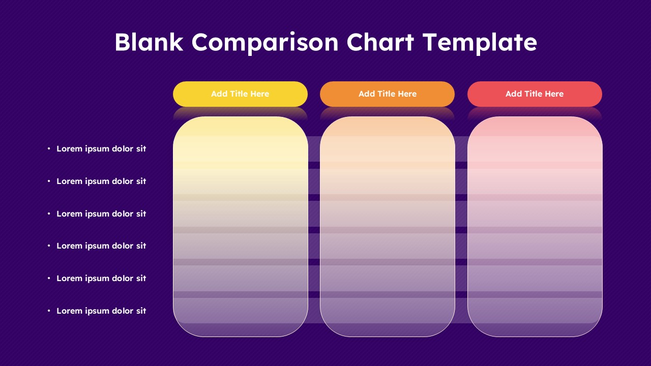
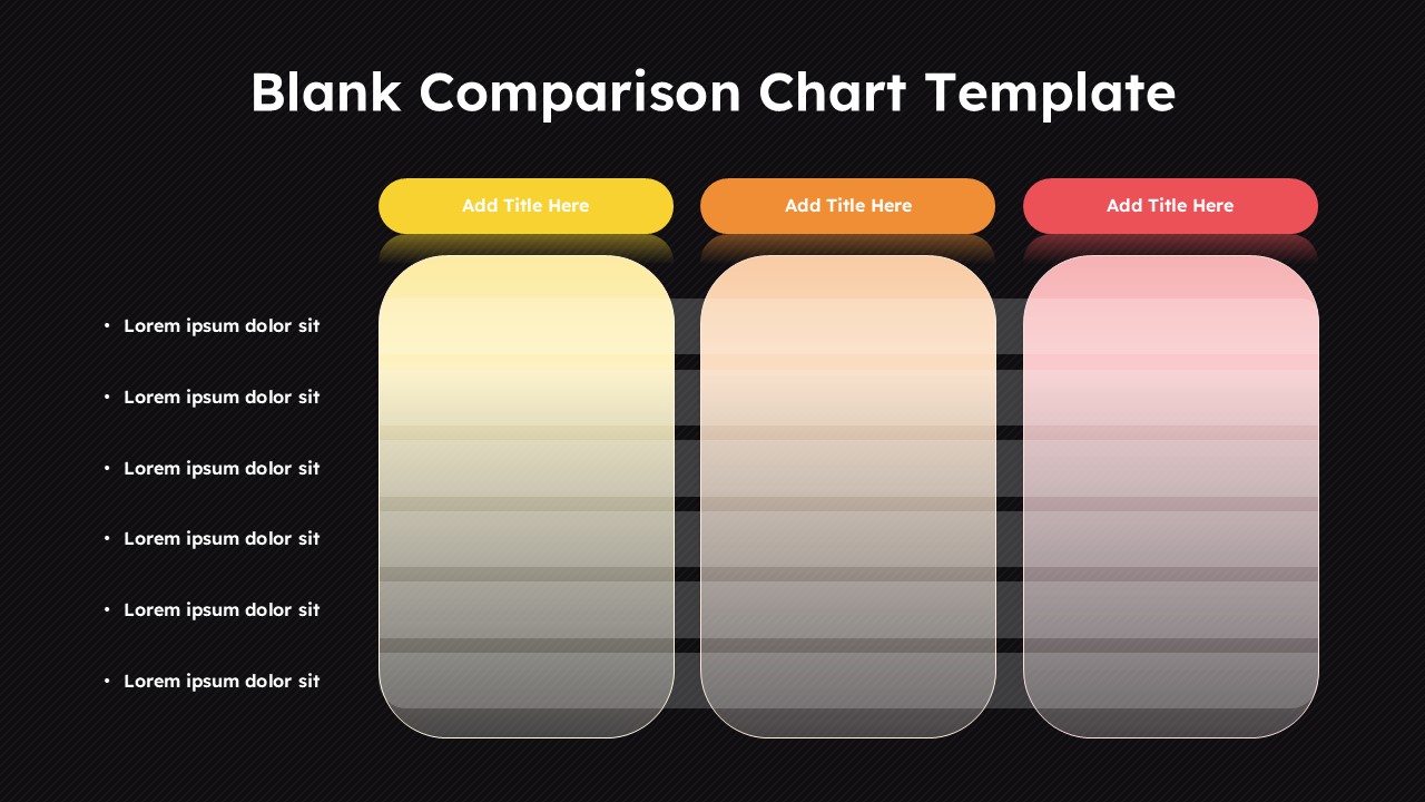
It is a single, focused slide with three clearly separated columns sitting on a deep purple background. Each column gets its own color-coded rounded header, yellow, orange, and red, so your audience visually separates the options before they read a word. Six evenly spaced rows run down each column, and a clean bullet list on the left tells the audience exactly what each row is measuring. The structure does the heavy lifting so your content does not have to fight for attention.
- Drop in product names, pricing tiers, vendor options, software features, hiring candidates, or budget scenarios across the three columns and the slide instantly becomes a decision-making tool rather than a data dump.
- The six-row depth hits the right balance for live presentations. Enough detail to be credible, concise enough to keep the room engaged without scrolling or squinting.
- Color-coded headers create a reading anchor. Audiences follow left to right naturally, and the distinct colors keep each option mentally separated throughout your entire explanation.
- Every cell is intentionally blank. Add text, icons, checkmarks, star ratings, or numeric scores depending on what your comparison actually needs rather than working around a rigid pre-filled format.
The template runs without friction in Microsoft PowerPoint and Google Slides, which means your team can build it locally, share it for live collaboration, and present it from any device without the layout breaking or the gradients shifting.
SaaS teams use it for feature matrix presentations. Consultants use it for vendor selection decks. Finance teams use it for budget option reviews. Product managers use it for roadmap prioritization discussions. Educators use it for curriculum comparisons. The slide adapts to the context because the structure is neutral and the content is entirely yours.
Frequently Asked Questions
What is a blank comparison chart template and how does it work?
It is a ready-made presentation slide with an empty grid built specifically for comparing multiple options against shared criteria. You add your titles, fill your rows, and present. No layout building, no alignment headaches, no starting from scratch.
What other situations can this comparison chart slide handle?
It handles pricing plan breakdowns, software evaluation decks, hiring assessments, competitor analysis reviews, course curriculum comparisons, and budget allocation presentations just as well as product comparisons. If a decision involves three options and a list of criteria, this slide fits the conversation.
How customizable is this template across PowerPoint and Google Slides?
Every element is editable, column headers, gradient fills, row depth, bullet labels, and background color, in both Microsoft PowerPoint and Google Slides. You can rework the color scheme, adjust the number of rows, or rebuild the column count entirely to match your specific comparison without losing the visual structure that makes the slide work.
Login to download this file
What do you think of this template?
-
Category:
Business -
-

-

Aspect Ratio: 16:9
-

Item ID: SPT0990
-

Designed by: Niranjana
-

Color
Related Templates
-

-

Dual Comparison Bar Chart Data Analysis Slide Template
Charts & Graphs
-

-

Blank Swot Analysis Template PowerPoint & Google Slides Template
Business Strategy
-

Column Chart Product Comparison 3D Presentation Template
Charts & Graphs
-

-

-

-
Growth Chart Infographic Template
Charts & Graphs
-

-

-

Free Column Chart Comparison Presentation Template
Charts & Graphs


