Stacked Column Chart PowerPoint Google Slides Template

Product Description
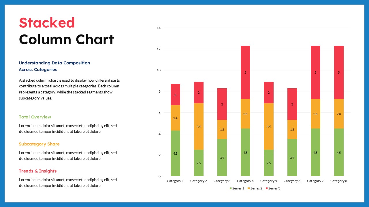
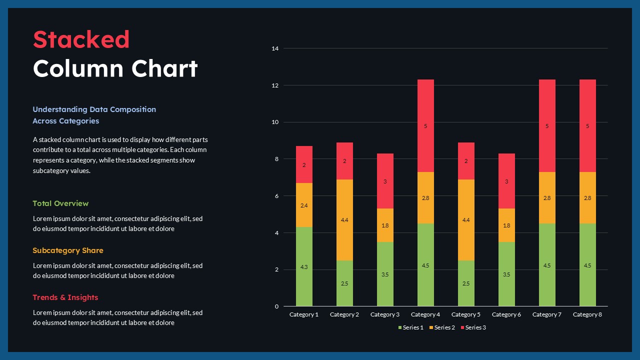
Present multi-layered data in a way that audiences can understand quickly with this professionally designed Stacked Column Chart template. Built for business professionals, analysts, researchers, marketers, educators, and reporting teams, this template helps organize complex datasets into visual comparisons that support clearer decision-making and stronger presentation outcomes.
The template uses a structured stacked chart layout that combines multiple data segments within individual columns, allowing users to display both total values and category composition at the same time. Instead of separating related metrics across different charts, the layout keeps connected information together so viewers can easily identify relationships, trends, and proportional differences across categories. It also works well alongside other Bar & Column Charts used for comparative business analysis.
Data Visualization Dashboard for Category Performance Analysis
The slide structure also supports a practical presentation narrative. Start with an overview of the dataset and explain the key metrics being analyzed. Continue by presenting category-based comparisons and data distributions, then move into trend observations and performance findings. The content panel beside the chart creates space for supporting insights, conclusions, and recommendations. This approach turns charts into a more meaningful business story rather than a simple display of numbers.
The design is available in both light and dark theme variations, allowing teams to align presentations with brand guidelines or meeting environments. Users can customize chart values, category names, colors, labels, and content sections while maintaining a clean and professional appearance.
Compatible with PowerPoint and Google Slides, this template supports both executive summaries and detailed reporting across industries such as finance, sales, operations, education, healthcare, and market research.
Frequently Asked Questions
What is a Stacked Column Chart?
A Stacked Column Chart is a data visualization method that displays multiple data series within a single column to show total values and the contribution of individual segments across categories.
Who can use this Stacked Column Chart template?
Business analysts, marketing teams, educators, project managers, financial professionals, researchers, and reporting teams can use this template for presenting data comparisons and performance metrics.
How to create a stacked bar chart in PowerPoint?
To create a stacked bar chart in PowerPoint, open your presentation and select Insert > Chart > Bar > Stacked Bar. After inserting the chart, a spreadsheet window will appear where you can enter or replace sample data with your own values. Add categories and multiple data series to create stacked sections within each bar. You can further customize chart colors, labels, legends, and data values to improve readability and match your presentation style. A stacked bar chart is useful for comparing total values while also showing how individual segments contribute to each category.
Login to download this file
What do you think of this template?
-
Category:
Charts & Graphs -
-

-

Aspect Ratio: 16:9
-

Item ID: SPT0757
-

Designed by: Niranjana
-

Color
Related Templates
-

Column Chart Product Comparison 3D Presentation Template
Charts & Graphs
-

Free Column Chart Comparison Presentation Template
Charts & Graphs
-

Free Clustered Column Chart Presentation Template
Charts & Graphs
-
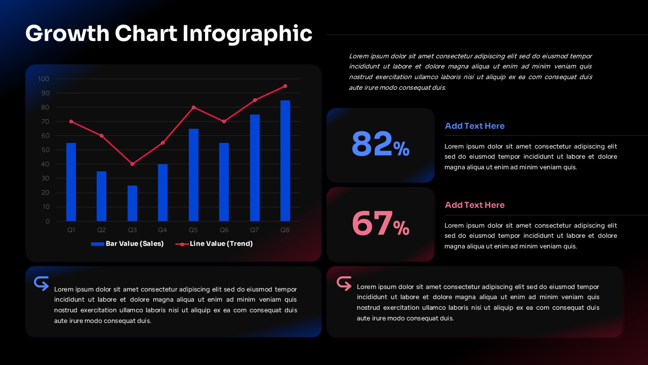
Growth Chart Infographic Template
Charts & Graphs
-

-

Free Multi Column Comparison Presentation Template
Infographics
-

-

-

-

-
-


