Causal Loop Diagram PowerPoint Template & Google Slides
Product Description
If you have ever tried to explain a feedback loop in words and watched your audience glaze over, you already know why this template exists. The Causal Loop Diagram Template was built for people who think in systems and need their presentations to keep up. Systems thinkers, policy researchers, business strategists, environmental scientists, and academic educators can stop rebuilding this diagram from scratch every time and start spending that energy on the analysis that actually matters.
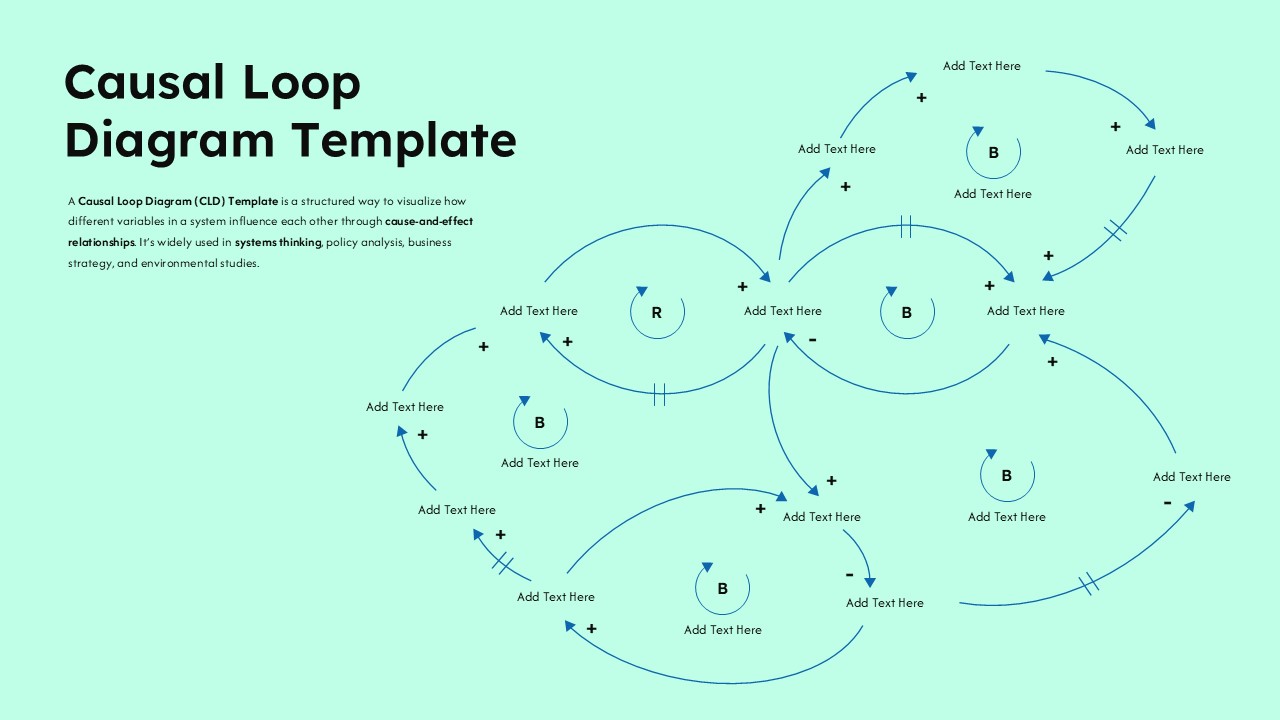
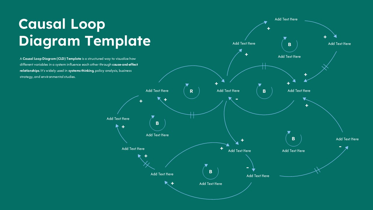
The diagram spans a mint green slide with a central Reinforcing loop surrounded by four Balancing loops, all connected through a web of curved arrows, polarity signs, and delay markers. It is not decorative. Every element carries analytical meaning, and together they give your audience a readable map of how variables push, pull, amplify, and constrain each other across a system.
- The central R loop is your story anchor. It represents the core feedback dynamic driving the system, whether that is accelerating market growth, a compounding organizational risk, or a self-reinforcing environmental cycle. Start here when walking your audience through the model.
- The four B loops surrounding it are where the complexity lives. Each one represents a stabilizing or constraining force, and presenting them outward from the center gives your narrative a natural expansion from core dynamic to system-wide tension.
- The double-bar delay markers are the details that separate a rigorous systems presentation from a superficial one. They tell your audience exactly where time lags sit in the model, which is critical for policy analysis, public health modeling, and supply chain risk work.
- Every label on every node is a fully editable text placeholder, so the only thing standing between this diagram and your actual system model is the time it takes to type in your variables.
Systems Thinking Presentation Template
This template does not water down systems thinking to make it palatable. It gives you the full analytical toolkit, reinforcing and balancing loops, polarity markers, delay indicators, and a multi-variable network structure, in a format that works in front of a government policy panel, a university lecture hall, a boardroom strategy session, or a research conference equally well. Teams documenting structured system pathways may also find our flowcharts templates useful for complementary process visualization. It opens and edits without friction in both Microsoft PowerPoint and Google Slides, so whether your team runs on Office 365 or Google Workspace, you are never fighting compatibility issues when a deadline is close. Swap in your variables, adjust the loop structure if needed, and you have a systems diagram that looks like it took a designer hours to build.
Frequently Asked Questions
What is a Causal Loop Diagram?
A Causal Loop Diagram is a systems thinking tool that maps how variables within a system influence each other through reinforcing and balancing feedback loops, using arrows and polarity signs to show the direction and nature of each relationship.
What other use cases does this Causal Loop Diagram Template support beyond systems thinking presentations?
Beyond systems thinking workshops and academic research presentations, this template adapts well to business strategy sessions mapping competitive dynamics, public health modeling presentations, climate and environmental impact analyses, organizational change management workshops, and supply chain risk briefings where understanding feedback relationships between variables is essential to making informed decisions. Its flexible node and arrow structure makes it reusable across entirely different system models without needing a layout rebuild.
Login to download this file
What do you think of this template?
-
Category:
Diagrams -
-

-

Aspect Ratio: 16:9
-

Item ID: SPT0708
-

Designed by: Niranjana
-

Color
Related Templates
-

-
-

End to End Process Flow Diagram Template for PowerPoint & Google Slides
Project Management
-

-

Risk Management Process Diagram for PowerPoint & Google Slides
Risk Management
-

-
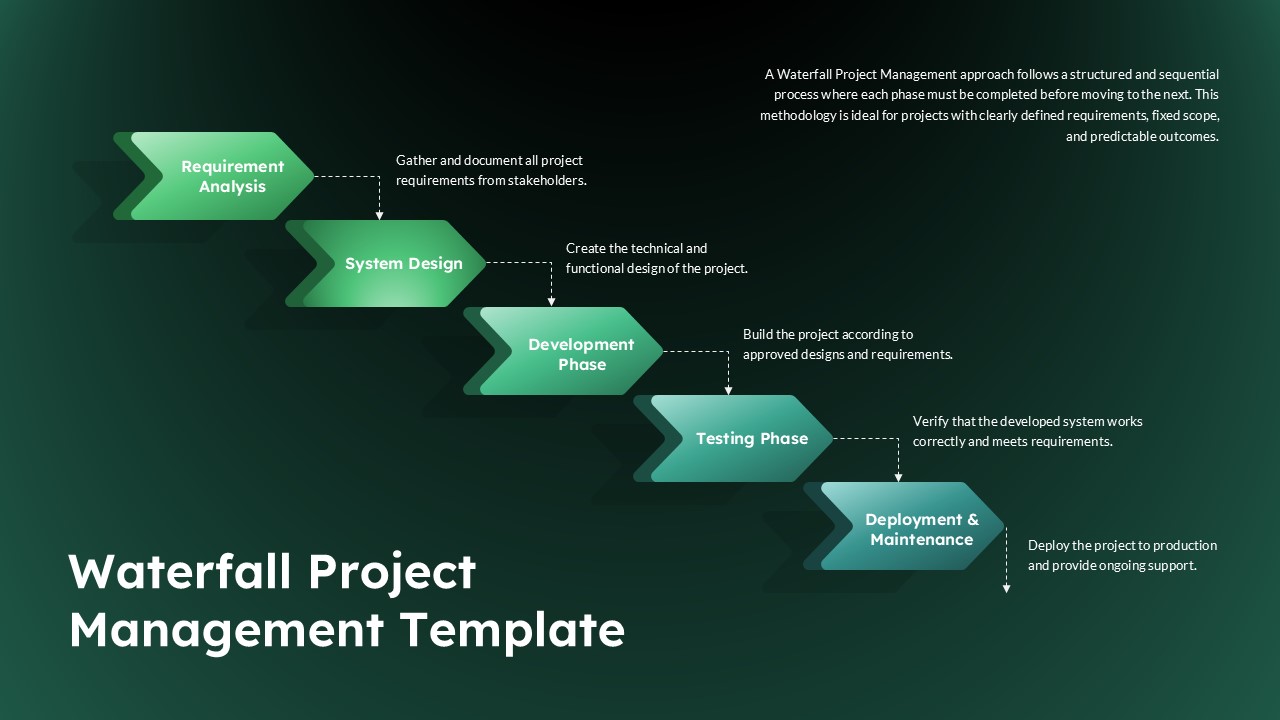
5 Phase Waterfall Project Management Template
Project Overview
-
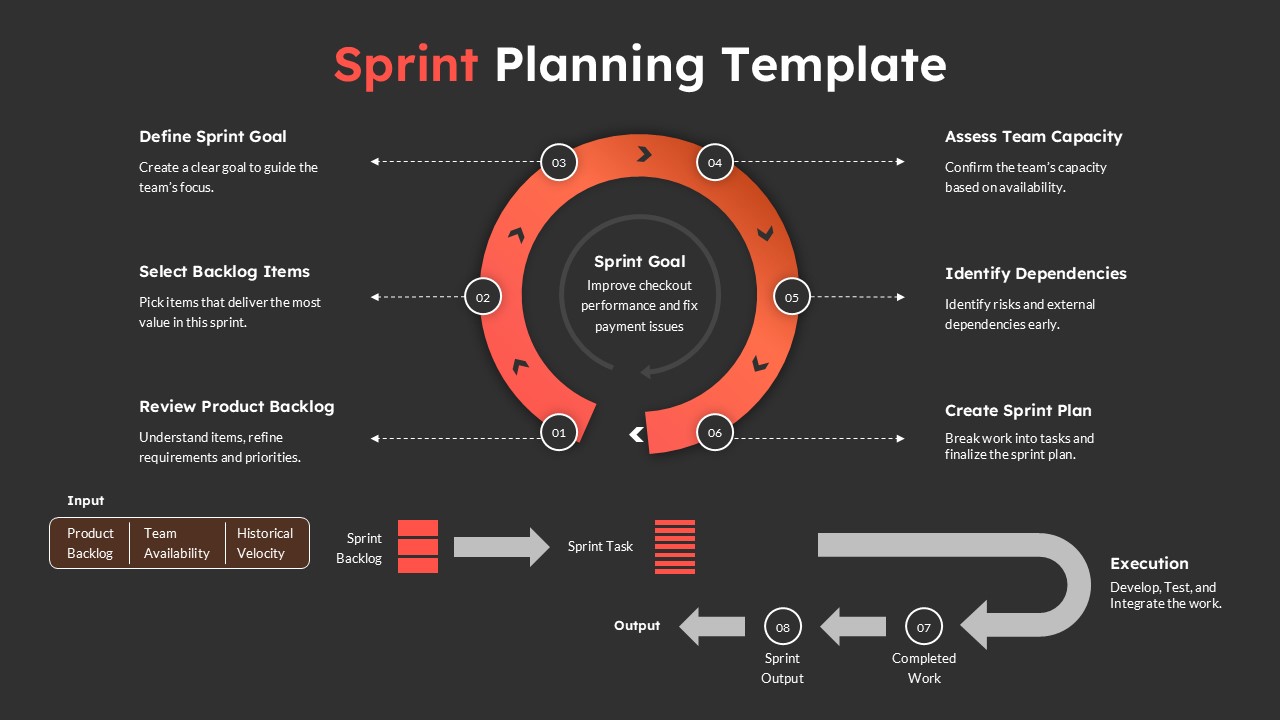
Sprint Planning Presentation Template for Agile Workflow Management
Project Management
-

-

Network Diagram Slide Template
Technology
-

-


