Cost Comparison Slide Template for Presentations

Product Description
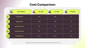
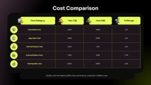
Quality Cost Analysis Table
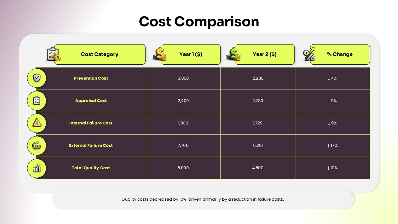
This Cost Comparison Slide Template presents a five row quality cost breakdown across two years with percentage change indicators, making it easy for finance teams, operations managers, and quality analysts to show how spending has shifted between periods in a single glance.
The five cost categories covered include:
- Prevention Cost, showing a 4% reduction from Year 1 to Year 2
- Appraisal Cost, reflecting a 5% decrease
- Internal Failure Cost, down by 9%
- External Failure Cost, showing the largest reduction at 17%
- Total Quality Cost, summarizing an overall 10% improvement
Each row includes a distinct icon, yellow category label, and downward trend arrow, reinforcing the cost reduction narrative visually alongside the numbers. A summary note at the bottom ties the data together with a plain language takeaway.
This quality cost comparison table works well for operations reviews, quality management presentations, and finance reporting decks. The template is fully compatible with both Microsoft PowerPoint and Google Slides, so teams can update figures and categories on either platform easily.
Frequently Asked Questions
Can I edit the cost categories and values in this Cost Comparison Slide Template?
Yes, all rows, figures, labels, and percentage changes are fully editable to match your own data.
Is this template suitable for quality management reports?
Yes, it works well for presenting cost of quality data in operations or finance reviews.
Login to download this file
What do you think of this template?
-
Category:
Business -
-

-

Item ID: SPT0712
-

Designed by: Krishnapriya
-

Color
Related Templates
-

Cost Benefit Analysis Matrix Google Slides & PowerPoint Template
Business Strategy
-

-

Critical Path Method Template for Presentations
Project Management
-

-
-

-
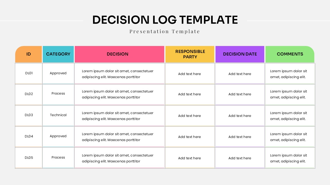
Decision Log Template For Project Management Presentations
Project Management
-
-
-

Dual Comparison Bar Chart Data Analysis Slide Template
Charts & Graphs
-

-