Color Coded Pie Chart Data Visualization Presentation Template


Product Description
Pie Chart Presentation Template for Data Visualization
Sharing data does not have to feel complicated. This color-coded pie chart slide template turns raw numbers into a story your audience can actually follow. Built for both PowerPoint and Google Slides, it gives you full editing freedom to match your brand colors, update percentages, and swap in your own text within minutes. Whether you are a teacher breaking down survey results or a manager walking a team through quarterly targets, this template fits naturally into your workflow.
Here is how you can put it to work:
- Sales teams can display market share splits across product lines at a glance
- Educators can present survey data or research findings in an easy visual format
- Marketers can compare campaign performance across different channels
- Project managers can show budget allocation or task completion ratios clearly
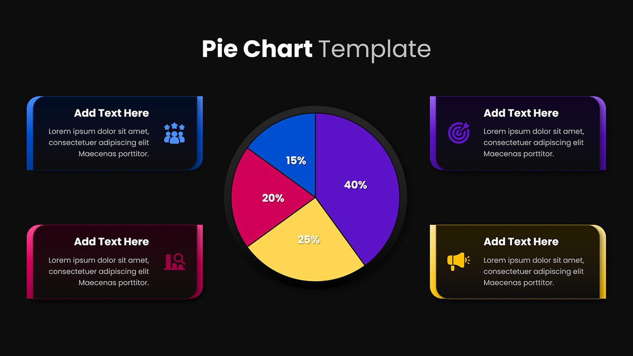
Each pie segment connects directly to a content box where you can add a heading, a short note, and an icon, so your chart never stands alone without context. The clean background and soft shadows keep the slide looking polished without feeling overdone. Because the layout is balanced, your audience reads both the visual and the supporting text naturally, without losing focus.
The four contrasting segment colors do the heavy lifting when it comes to readability, making comparisons quick and obvious even for viewers who are seeing the data for the first time.
Stop spending hours building slides from scratch. Download this pie chart presentation template today and walk into your next meeting with visuals that are clear, professional, and ready to impress.
Login to download this file
What do you think of this template?
-
Category:
Charts & Graphs -
-

-

Aspect Ratio: 16:9
-

Item ID: SPT0038
-

Designed by: Krishnapriya
-

Color
Related Templates
-

Pie Chart Infographic Data Visualization Presentation Template
Charts & Graphs
-

-

Free Area Chart Data Visualization Presentation Template
Charts & Graphs
-

-

-

-

-

-

Modern Pie Chart Analysis Presentation Template
Charts & Graphs
-

-

Pie Chart Presentation Template for PowerPoint & Google Slides
Charts & Graphs
-


